Payment Processing Platform
Puraido
My Role
Senior UX/UI Designer - Competitive Analysis, Interaction Design
Timeline
3 Months
Overview
The client vision is to reshape digital commerce by offering a complete payment processing platform where online merchants and businesses can easily manage their online operations.
The client had approached me with an MVP version of the platform; however the visual side and performance haven't been on an appropriate level. Additionally, from a UX perspective the platform required users with deep technical knowledge of payment processing to navigate the system effectively.
I designed a user-friendly and efficient UI for online merchants and businesses to easily manage their online operations.
Context
What did the client expect?
✨
Modern Design
The website should feature a modern design that effectively conveys the platform's innovation and reliability.
🎯
Cater to Target Users
The platform should exclusively cater to Online Merchants ensuring a targeted and specialized user experience.
😊
User-friendly Interface
A user-friendly interface should be developed to accommodate both Merchants and Operators
Results
Before
-
Lacked a coherent site architecture, requiring users to navigate back and forth across multiple pages to complete basic workflows. -
Non-intuitive UX that failed to communicate how functions operated. -
Steep learning curve due to complex and unclear interface mechanics.
After
-
Reimagined architecture that made core features easily accessible. -
Delivered a clean, modern, and visually appealing design aligned with the client’s expectations. -
Conducted competitor analysis to identify strengths and improvement opportunities, resulting in a more competitive and user-friendly product.
Highlights
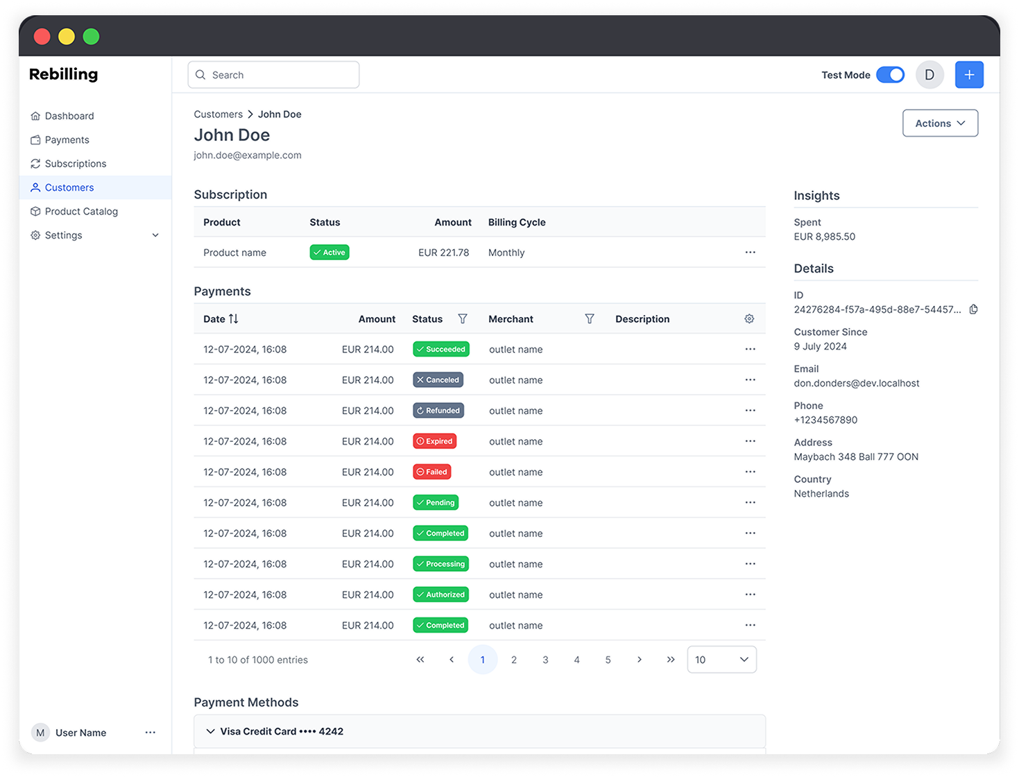
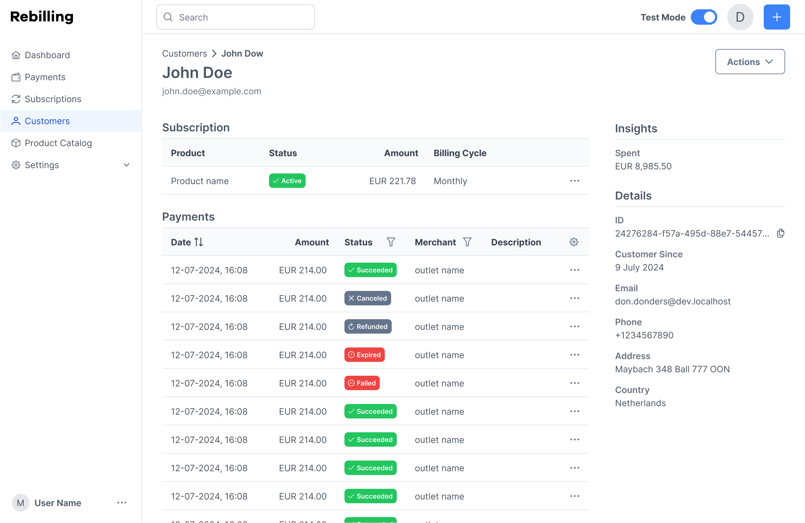
An end-to-end payment solution for online businesses
Dashboard
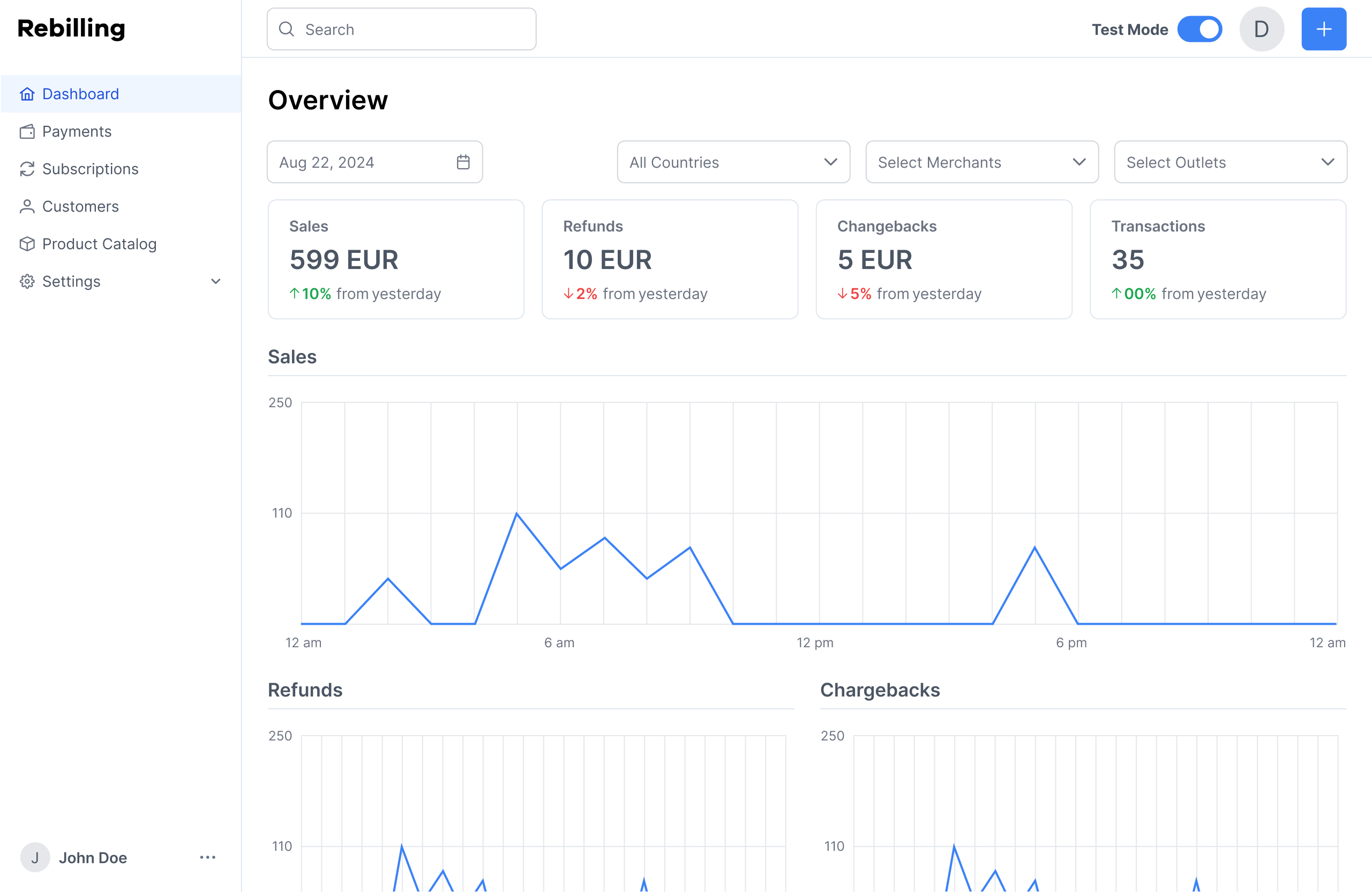
All Payments
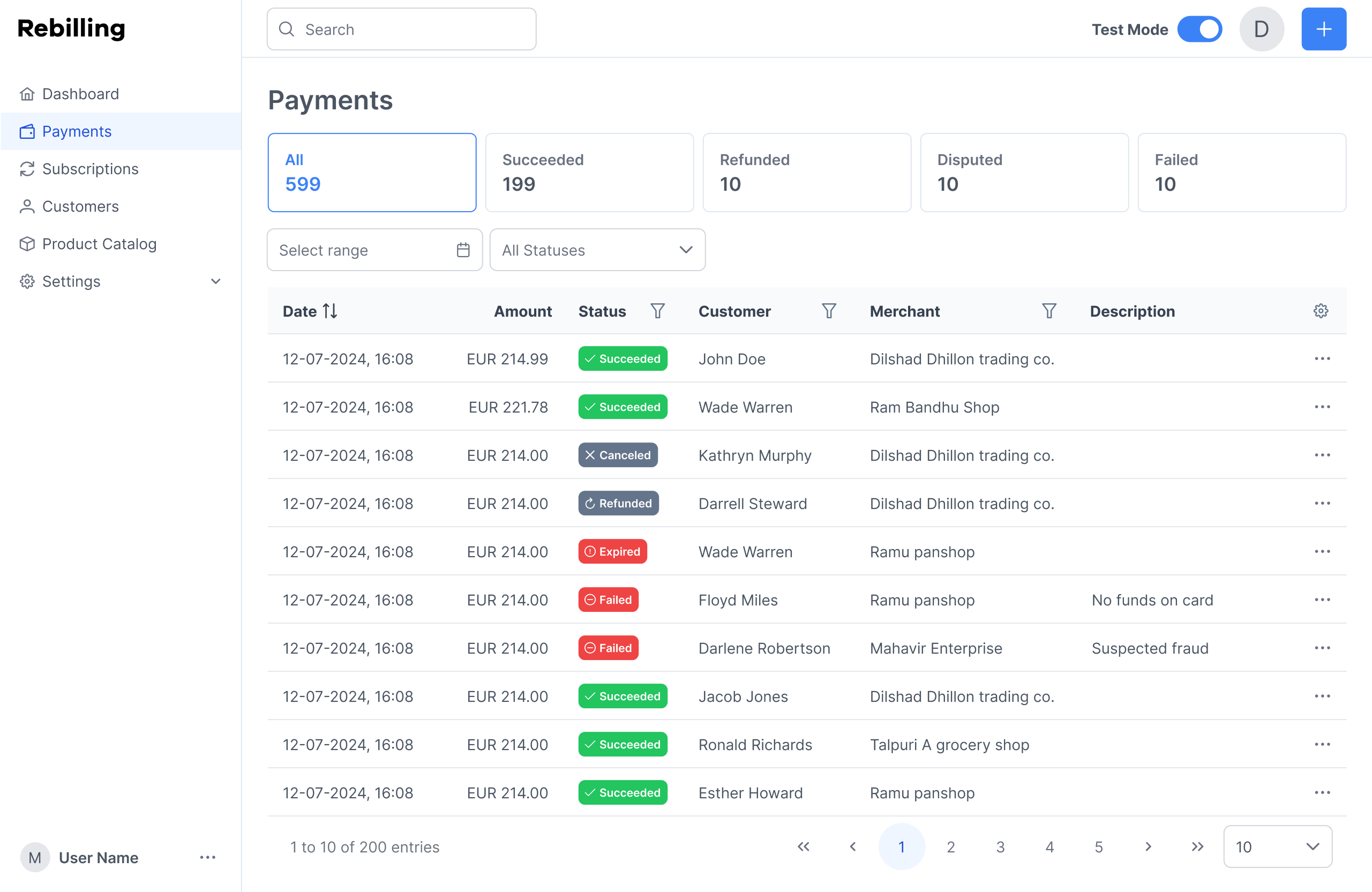
Payment Details
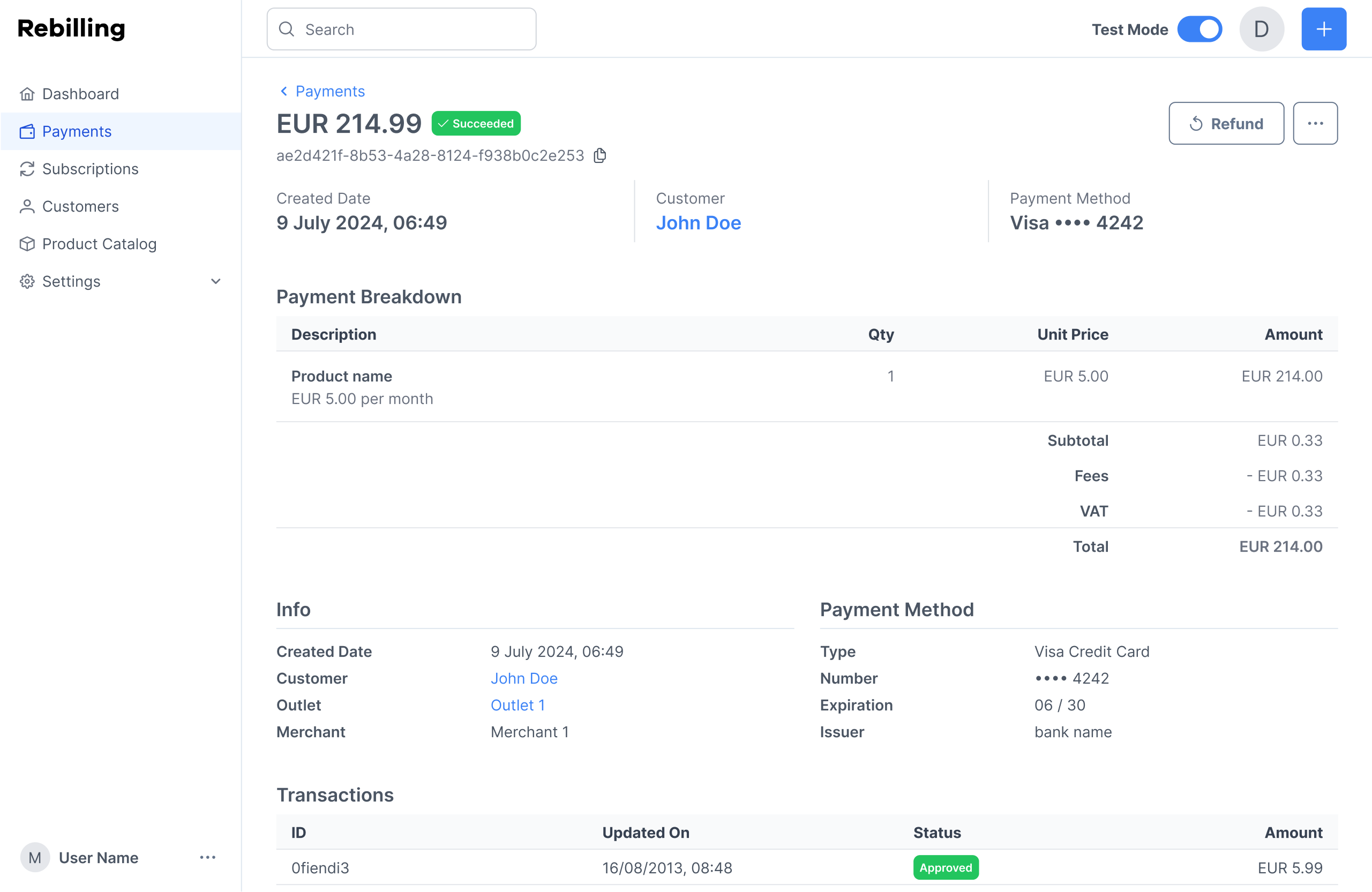
Customer Details
Design
Rethinking User Flows: from Chaos to Clarity
Creating a better user experience by simplifying complex workflows. This is how I improved product creation flow into an efficient process.
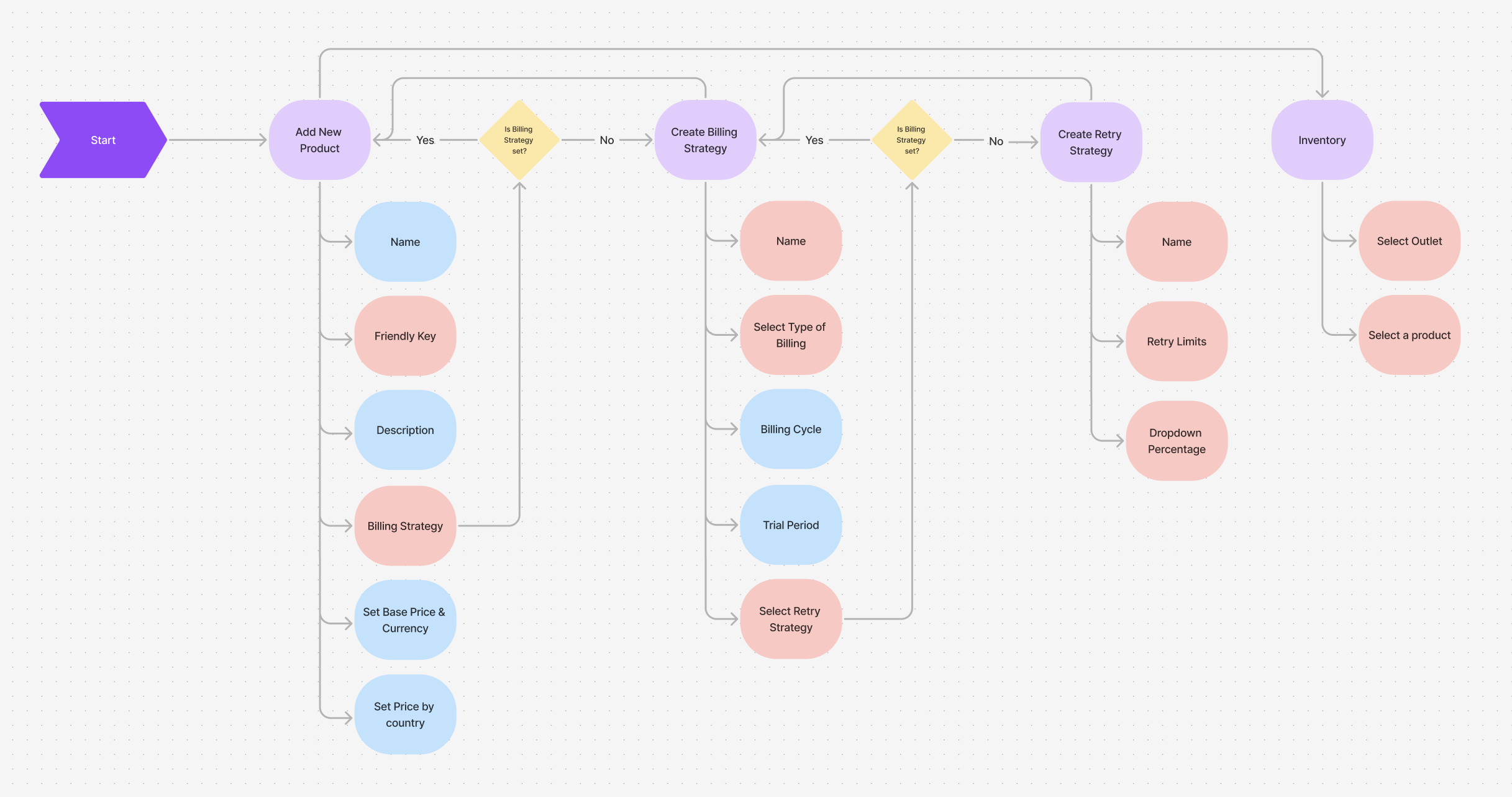
Before
-
High Customization - merchants can customize retry and billing strategies for each product. -
Lack of instructions on what needs to be set up before product creation. -
Too many stages required before completing product creation. -
Users have go back and forth between steps if configurations such as retry or billing strategies are not already created.
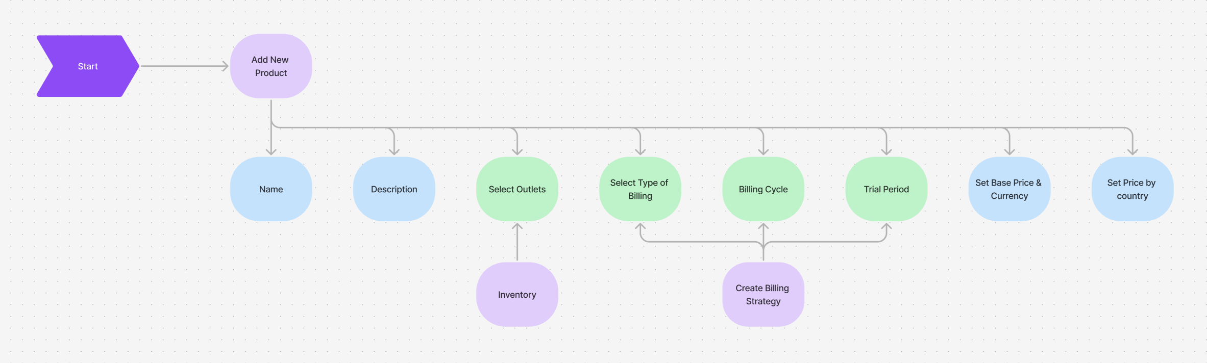
After
-
Consolidates all essential steps into a single streamlined process, reducing the cognitive load. -
Reducing friction by eliminating the need to go back and forth between steps. -
Steps are logically arranged, making it easy to complete the process in one go. -
Limited options for individual customization of retry and billing strategies.
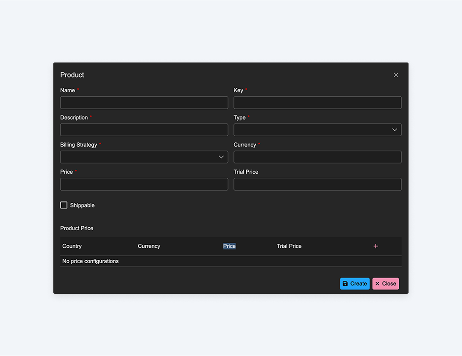
Design
The goal was to develop a user-friendly platform with an intuitive interface, enabling users to navigate and understand the system easily based on behavioral research and best practices.
Before
-
Lack of logical grouping or spacing between related fields. -
Some field names are less intuitive or lack context. Users might not immediately understand what options are. -
Minimal spacing between elements makes scanning difficult. -
Red color for the "Close" button may confuse users that it is a destructive action.
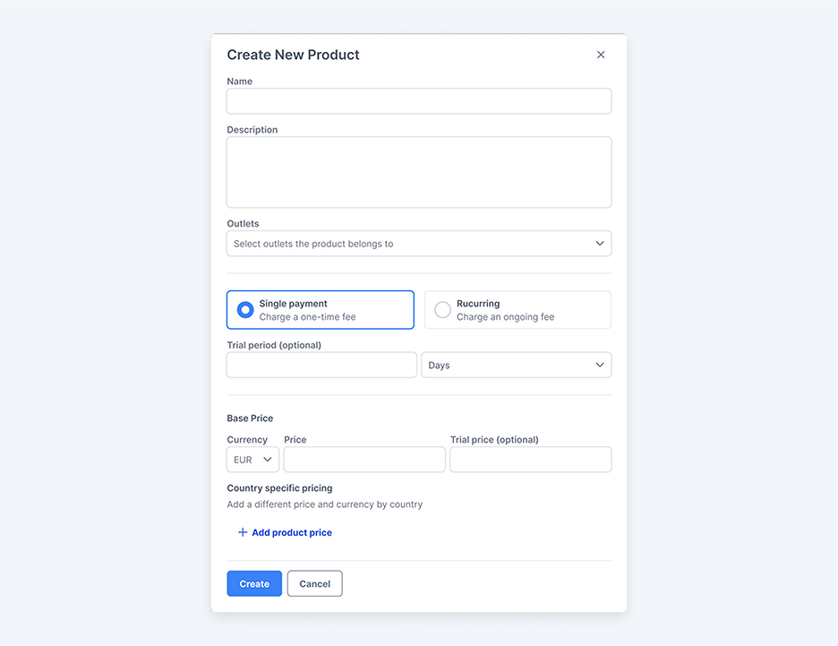
After
-
More glanceable due to its visual Hierarchy. -
Clear, descriptive labels immediately explain the purpose of each control. -
Related fields are grouped together with labels and separators, making the information easier to scan and understand. -
The "Create" and "Cancel" buttons are labeled clearly and provide a standard exit or confirmation action.
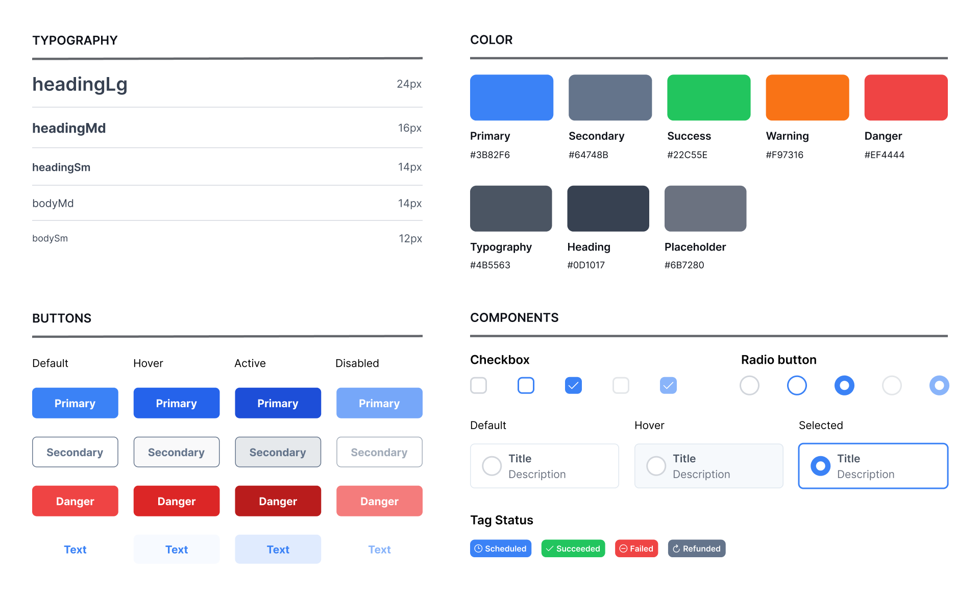
Design System
The redesign followed the PrimeReact library for consistency and ease of development, as it was already used in the platform. The design system was created in Figma to align with PrimeReact components.
Lessons
What I've Learned
🔑
Communication is Key for Aligning the scope
Defining project scope can be challenging, but clear communication helps align goals and expectations between stakeholders.
🥇
The More I Learn, the More I Can Contribute.
Learning how payment processing works, including its terminology, processes, and functionalities expanded my knowledge and improved my designs.
🤝
Understanding How to Improve the User Experience
Improving usability requires a deep understanding of workflows and functionality to create a clear and easy to use interface.