Analytics Dashboard for Project Management
Taskworld
My Role
Senior UX/UI Designer - Competitive Analysis, Interaction Design
Timeline
Mar to Jun 2023
Overview
Analytics has been underutilized due to a critical gap in the way users can view statistics across all projects. Users are forced to navigate through individual project data, which is cumbersome and time-consuming.
I collaborated with a product designer during the discovery phase to gather customer insights and identify the key data users needed for analytics. We then worked closely with the data team to determine the most effective ways to present this data.
After launch, the improved analytics feature had a 2400% page view increase compared to the old version, with 18% of weekly users checking in daily and an average of 1.2 visits per week. It's clear people are finding it easier to understand their project performance.
Context
Objective
Revamp the Analytics feature to make it more user-friendly, intuitive, and engaging. The new design should offer users the ability to see statistics for all projects at once, encouraging more frequent and meaningful interactions with our analytics tool.
Research
Conduct Interviews
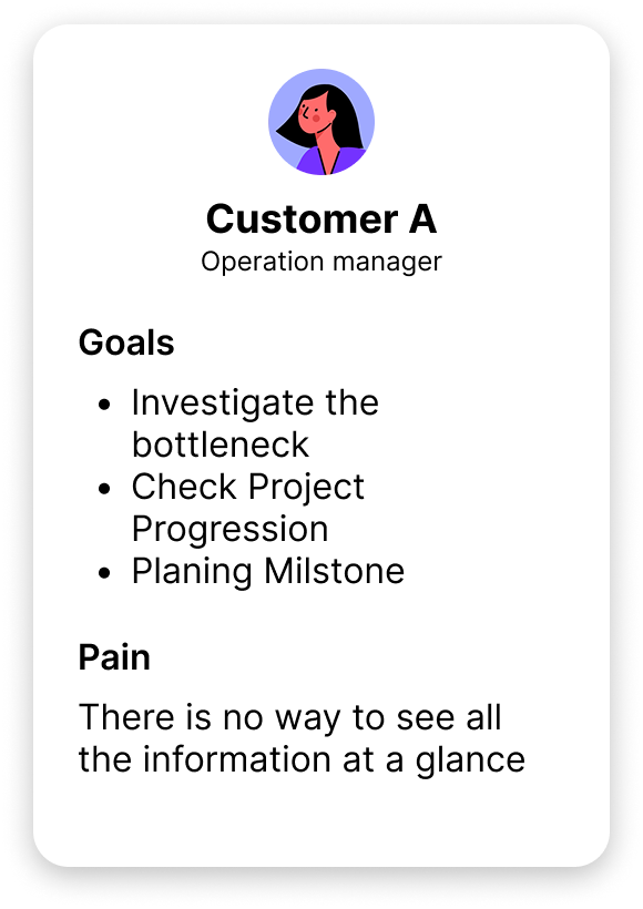
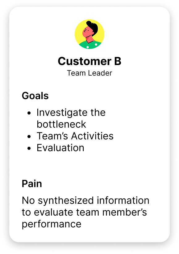
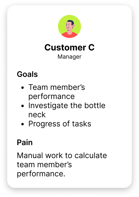
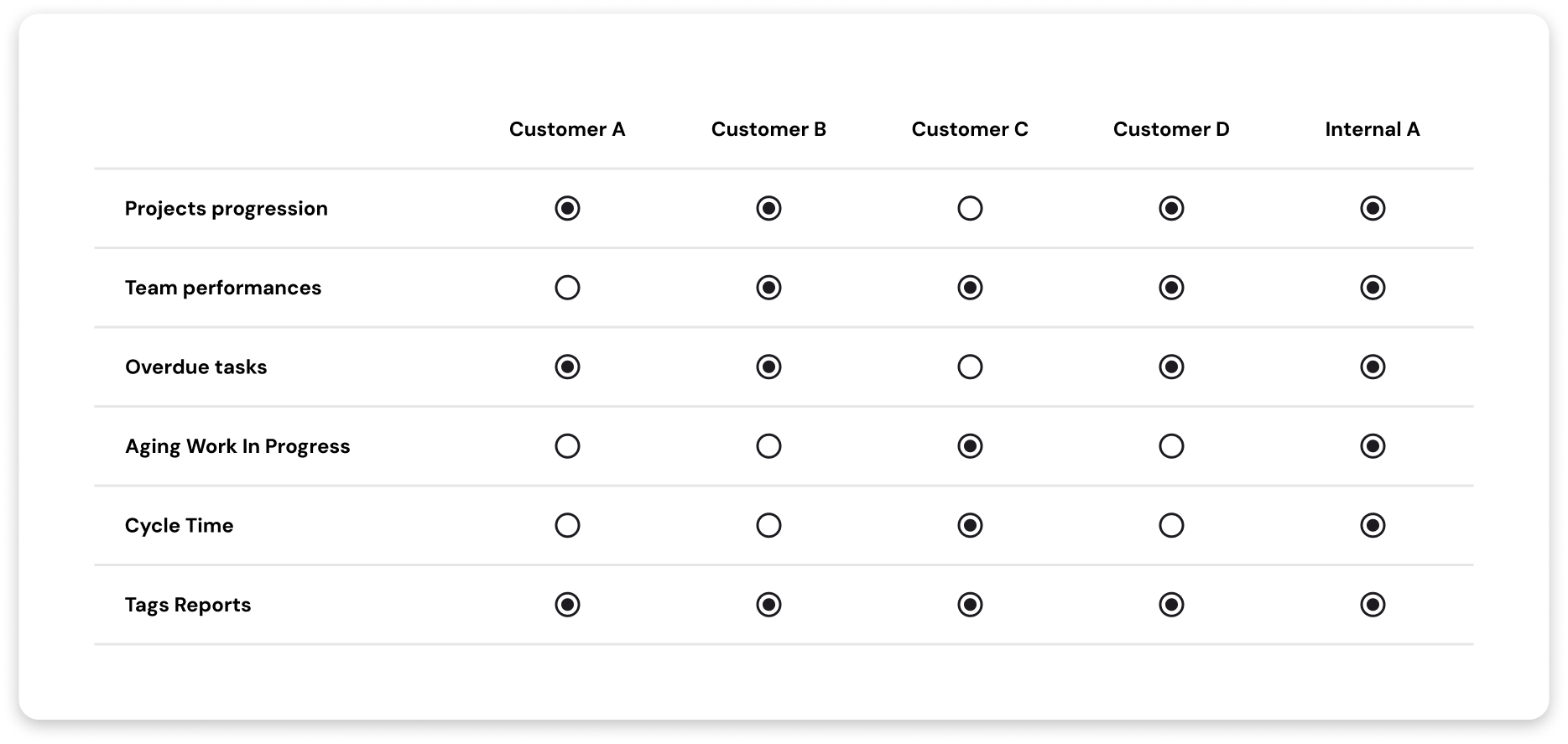
In order to better understand our customers needs regarding analytics, we had arranged interviews with our customers across a broad range of usage scenarios. In total we had interviewed four customers to gather more insights on their needs.
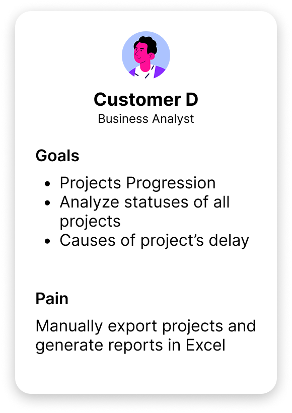
Problem
“Analyzing projects in Taskworld is cumbersome. Users have to manually extract data to create reports, which hinders efficiency and makes it hard to monitor project performance”
Key insights
After conducting customer interviews, I held a brainstorming session with my teammates to identify the most commonly needed report types among users for inclusion in the dashboard.
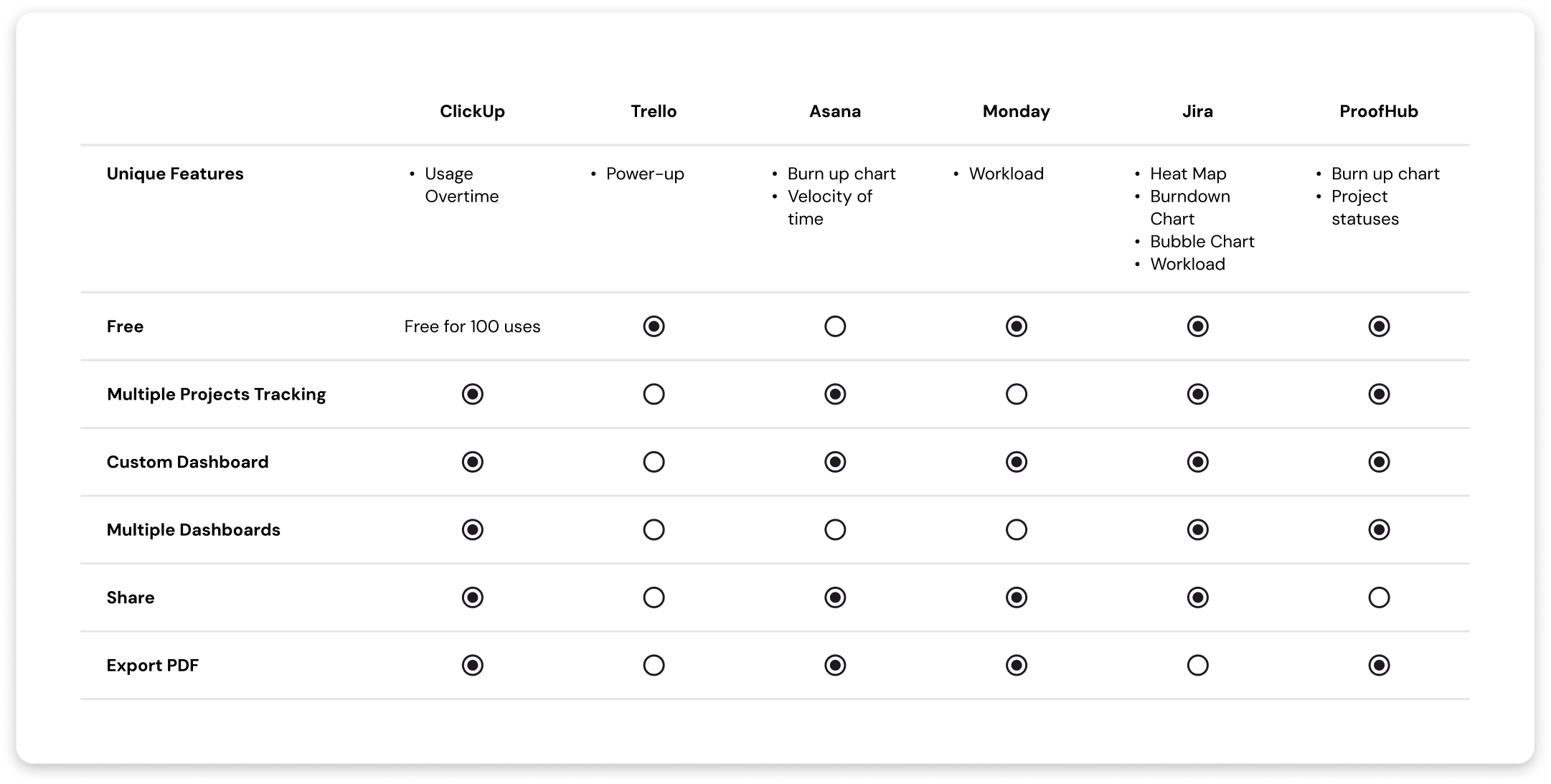
Competitive Analysis
We conducted competitor analysis to identify key features commonly found in industry-standard project management dashboards.
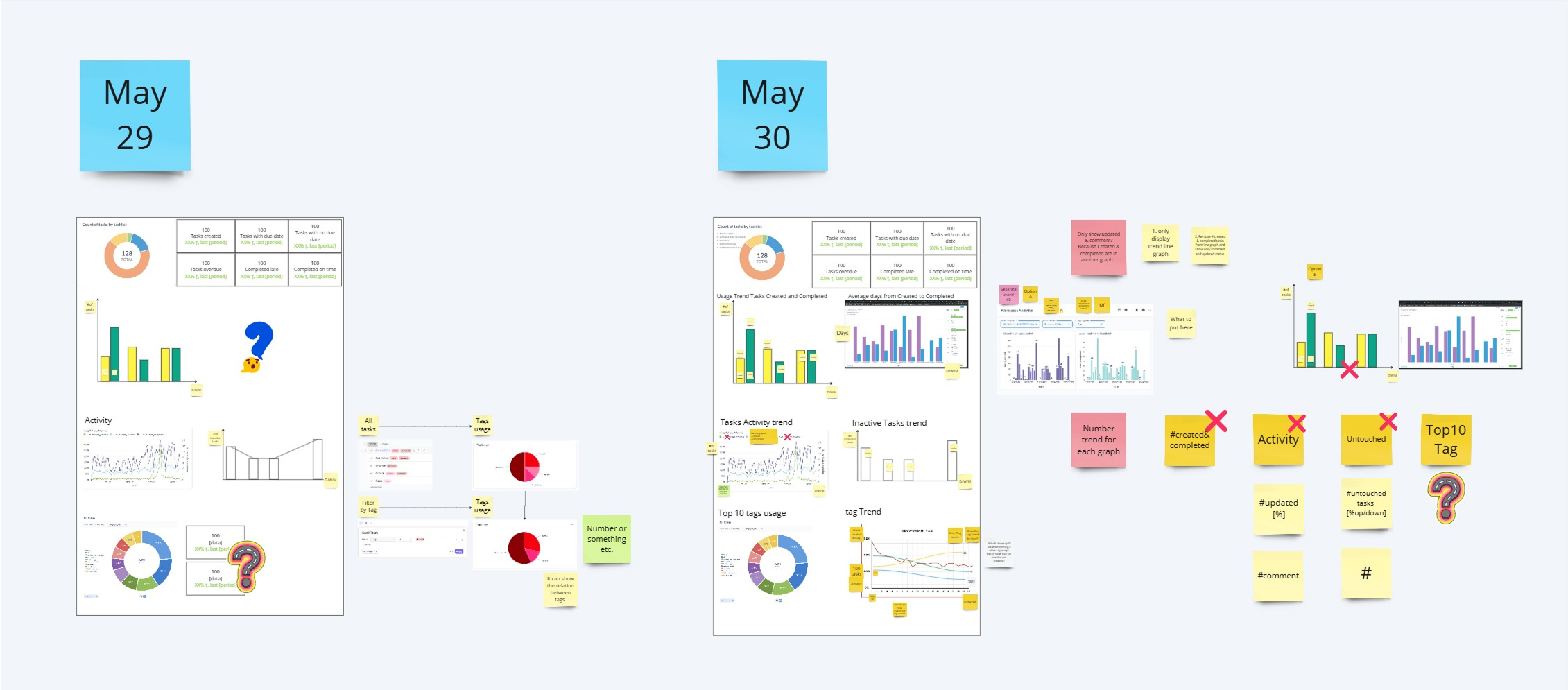
Ideate
Conduct Interviews
Goals
- Determine the appropriate visualization that showcases the data.
- Finalized the functionalities of the filter and aggregation controls.
Results
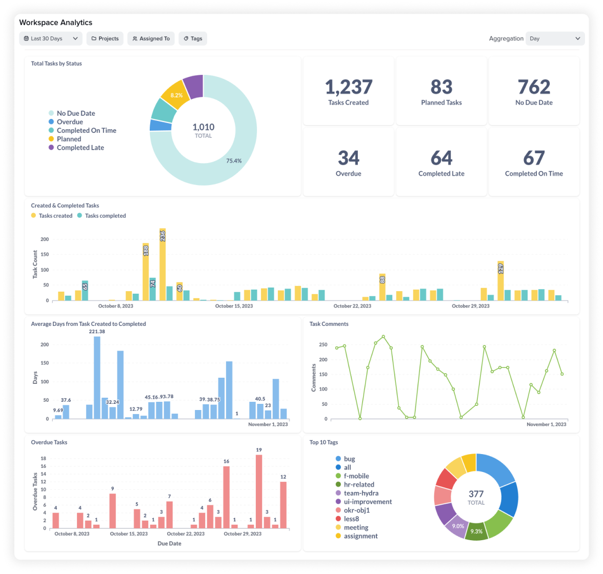
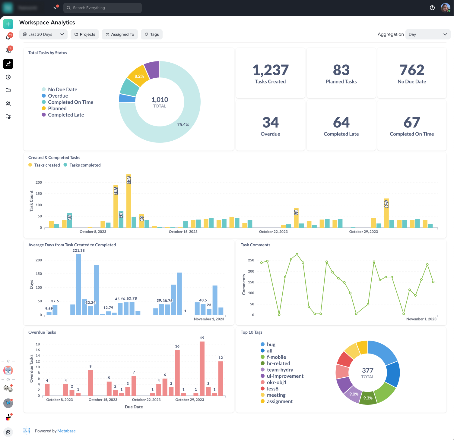
We finalized the visualizations and brokedown the analytics feature into three parts.
-
Filters and aggregation
This allows the user to scope the report down from multiple projects into a single report within a chosen timeframe.
-
Summary and overall statuses
Users can have a glance of overall task statuses in the workspace in the given period.
-
Detailed visualizations related to specific metrics
- Created & completed tasks: Track the number of tasks created and completed within a specific timeframe.
- Average Days from Task Created to Completed: See the average time it takes to complete tasks from creation to closure.
- Task Comments Activity: Analyze comment frequency to gauge team engagement and identify potential bottlenecks.
- Overdue Tasks: Pinpoint bottlenecks by filtering overdue tasks by project or team member.
- Top 10 Tags Usage: Gain insights into tag usage trends to assess project progress and categorization.
Design
Final Design
We went through several iterations of the new analytics feature in collaboration with the Data Team before settling with the final data visualizations that can help our customers solve their data needs.
Before
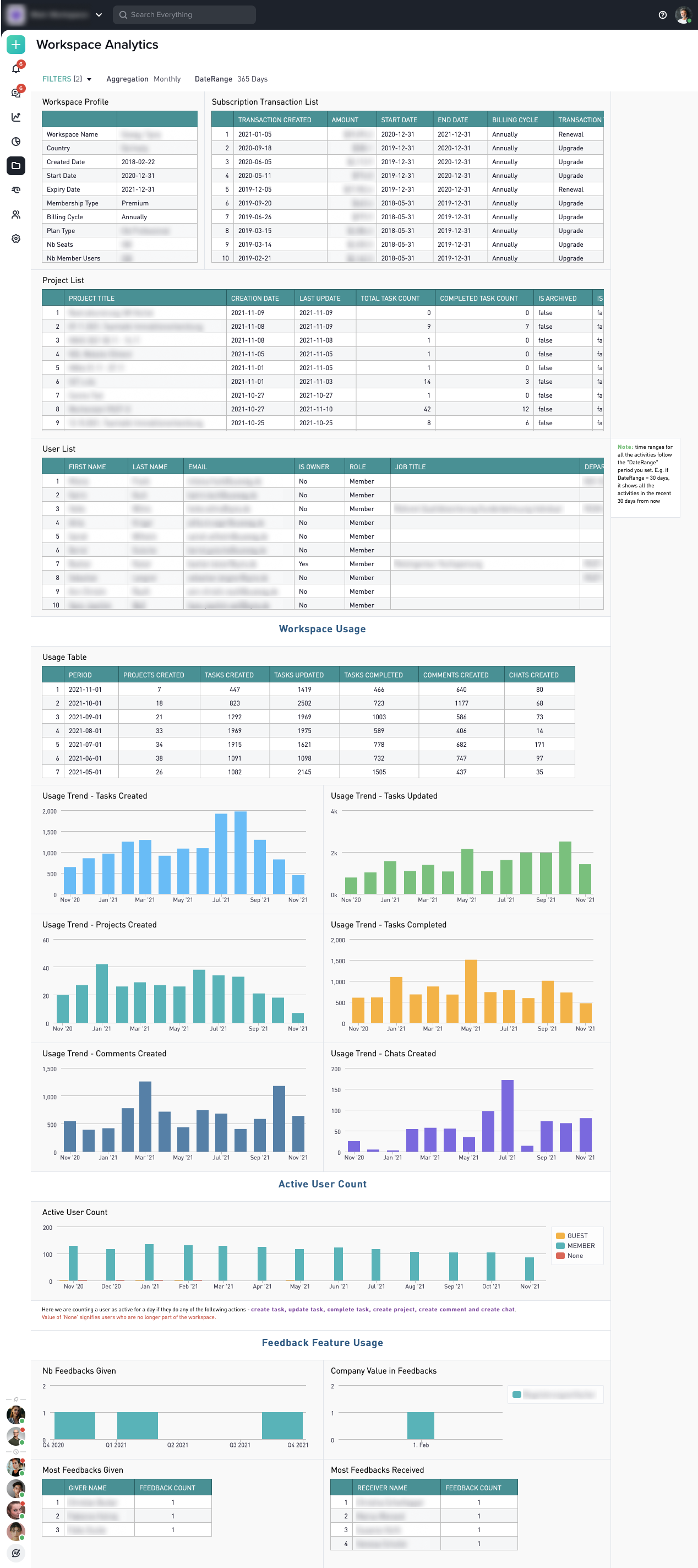
-
No filter options to scope down by their preferred criteria. -
Showcase redundant information as it can be found on other pages. -
No valuable insights into performance or bottleneck. -
Hidden in the workspace settings which is limited to the certain role of the platform.
After
-
Allow users to track data based on their preferred filter criteria, such as Period, Projects, Assigned to, and Tags. -
Ability to the monitor all or selective projects in the workspace. -
Managers can now easily monitor the number of tasks assigned to team members, along with the average time taken from task created to completion. -
Adding analytics access to the main navigation made it more accessible for all members.
Results
Average Daily Page Views Increase in 2023
We measured the overall usage by tracking the average page views of the analytics page and compared with the old version
2,400%
Page views increased from the old version
1.2 times / week
Average times users visit the analytics page
18%
Average of weekly users that return every day
6%
Average of monthly users that return every day
Overall we saw a dramatic increased in usage of the new analytics feature. The 2,400% increased in page views can be attributed to the placement of analytics in the main navigation bar.
Key Takeaways
🔑
Understanding User Needs is Key
By conducting interviews and gathering insights, we identified pain points and designed a more engaging analytics experience.
🥇
Leading an End-to-End Project
From collaborating with different teams, organizing interviews and making key decisions, this experience was both challenging and rewarding.
🤝
Tackling Constraints with Cross-Functional Teams
Working with the data team helped us overcome constraints. They provided solutions and evaluated feasible visualizations for the dashboard.